

adamcadre.ac
This writer/game designer’s home page is full of interesting hypertext flourishes.
This link was passed on to me by David Yates a while ago and I’ve finally had some time to explore it further. And it turns out there are quite a few interesting uses of links and layout that could be useful to anyone out there who is designing a TiddlyWiki[1]—for instance, the detailed organization of Adam’s favorite songs and albums page or the multiple views for the archives of the blog (called the ‘calendar’—which has been around since the 1990s.)
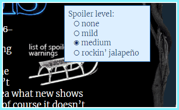
One of my favorite little touches is the presence of mouseover boxes throughout the essays in the ‘calendar’. In the small screenshot above, you can see a spoiler rating mouseover shown on the Stranger Things review. But there are footnotes, images, even short videos that will pop up when you hover over certain dotted links. (These remind me of the footnotes and links on philosopher.life—but with more effort put into designing them—they may have unique colors or borders.)
More than anything, this highlights again the range of things you can do with a website that just isn’t possible on social networks or Medium blogs—perhaps only an app of some kind could be customized like this.
The site also brought to mind this quote from the recent ‘Writing HTML in HTML’ article:
But how can I then keep the style and layout of all my posts and pages in sync?
Simple: don’t! It’s more fun that way. Look at this website: if you read any previous blog post, you’ll notice that they have a different stylesheet. This is because they were written at different times. As such, they’re like time capsules.
Like Phil Gyford’s site, the pages throughout Adam’s site often each have unique designs which hearken to the author’s style and sensibilities during the time when they were created. I feel like websites like this have fallen out of favor—but access to these old designs is now full of nostalgia—so perhaps we will see more hand-crafted HTML in the same way that we now see a TON of wonderful Windows 95 ripoffs in web design and gaming.
And, if you are, you should really be checking out the recent ‘outrun’-colored tags and tighter design on sphygm.us. Or the erratic page-filling that is happening on chameleon’s wiki. ↩︎